
The simplest, most cost-effective way to jazz up one’s film photography is to spring for a new film stock. Sure, you could seek a rare lens or a unique body, but nothing beats the ease of buying whatever film is trending. Such is the case with the so-called “Fujicolor Industrial 100,” an apparent darling of the online film photography community.
Some films, like HP5 Plus or Portra 400, are tried and true, infinitely popular, and super respected. Others are landmark consumer films that boast bang for buck but don’t necessarily differentiate themselves from the crowd, such as Superia 400 or Kodak Ultra Max 400. Then there are the zeitgeisty films – the film of the moment that signals a shooter who’s either a seasoned pro with specific tastes, or a seasoned hashtag watcher. Think JCH Street Pan.
In addition to these mainstay types of 35mm films, I would venture to say that there’s an additional category; the quirky films. These are films that are perhaps less well known. Films that perhaps require someone well initiated into the rituals, traditions, and advancements of shooting film to have even heard of them. How can one be expected to know Rollei RPX 400 if they’ve never shot Tri-X or Delta 3200?
Fujicolor Industrial 100 is this type of film – obscure, but more and more often finding itself wound around take-up spools of film photographers looking for something different and interesting. I too was captured with the allure of the mysterious stock – Japanese export only, allegedly sold only in bulk (and then pared down into single rolls by retailers), and with the sexy moniker of “Industrial.”
This must be serious stuff, I thought.
As it turns out, the film is not everything it’s advertised to be. But it does offer a look distinct to only a handful of films on the market today.


A Tale of Two Films
Fujicolor Industrial 100 is billed as a film for “business purposes,” per the writing on the film box. The oldest reference to any sort of “Industrial” Fuji film is from 2010. As to why the film became translated as “Industrial,” the jury is out.
Looking around online, the film sells in bulk packs out of Japan and some Western retailers have begun stocking the film as a single roll purchase. Fujifilm Japan has what seems to be a complete lack of information on the film on their own website.
I scoured the proverbial depths of the internet looking for some reliable information on the film stock. Something to fill in the gaps of when Fujifilm started producing this film, why they produce it at all, and what’s going on at the microscopic, emulsion layer of the stock. Dozens of website translations later and, for the most part, the film is nowhere to be found.
However, better sleuths than I uncovered Industrial’s closet-skeletons long before I could claim to have noticed. As it turns out, Fujicolor Industrial 100 is actually just rebadged Fujicolor 100 Japan, Fujifilm’s standard level ISO 100 color negative film in Japan.
All stripfilms have data printed into the area around the film perforations (also called sprocket holes). This data can be grouped into two categories; human-readable and machine-readable. Think of this distinction as the difference between a barcode and a written product descriptor.
Among the information, which includes frame numbers and branding information, is what is known as a “latent image barcode.” “Latent image” refers to the fact that this information is only visible once the film has been exposed (hence, it is only latent in new, unexposed film). “Barcode,” of course, refers to the machine-readable code on the strip’s perimeter.
(Interesting to note, the patented, barcode invention wasn’t in widespread use until the 1980s. As such, the authors Carlson in their 1981 The Professional Cameraman’s Handbook feel the need to specify that Agfa calls their film’s latent image a “BARCODE”; it wasn’t long, then, until the rest of the world followed Agfa’s suit in referring to the latent image code as a barcode.)
In any case, this barcode makes it relatively simple to compare unidentifiable films with other films. Jon Manjiro did just that with the so-called Fujicolor Industrial 100 and Fujicolor 100J. As can be seen from his scans (which are published here with his permission), Fujicolor Industrial 100 and the standard Japanese Fujicolor 100 possess the same identifying data.

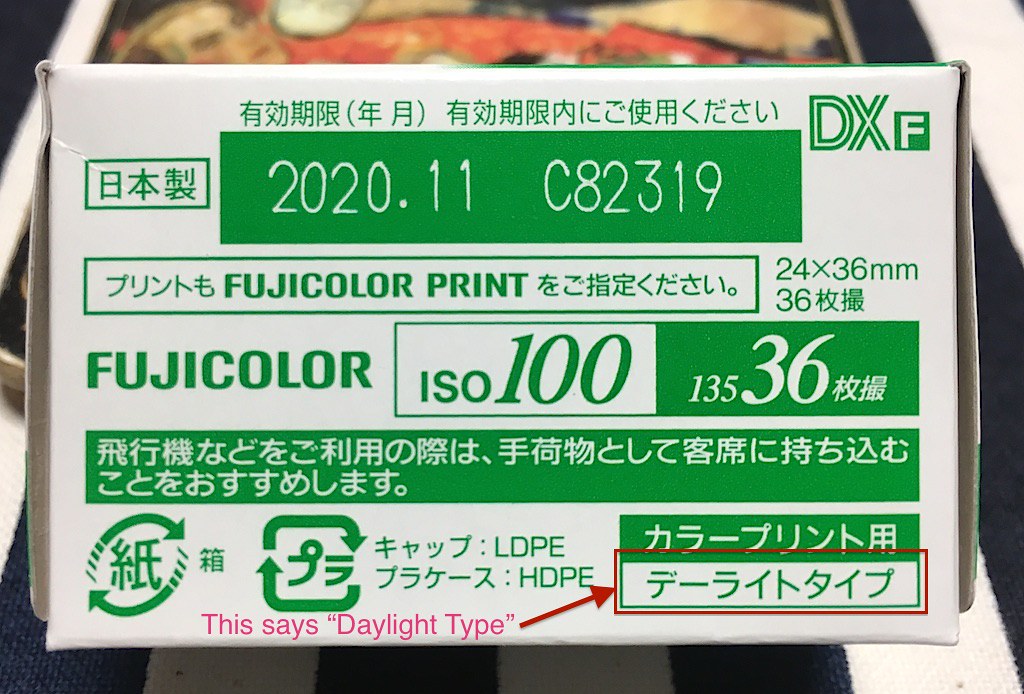
Rebadged or repackaged film is not unheard of, given arrangements between producers and consumer-direct retailers. This said, I have some reason to second-guess the notion that the Industrial stock is the exact same emulsion as the standard Fujicolor 100. Where the latter is daylight balanced, the former appears to be far closed to a tungsten balance.
Tungsten
Back in 2016, CP writer Josh covered Cinestill’s 800T film. In his profile of the film, he delved into the differences between daylight-balanced film and tungsten-balanced film. Where a daylight balance accounts for the temperature of sunlight at a Kelvin temperature rating of 5,500K. A tungsten balance accounts for a lower rating of around 3,500, which produces a warmer light – any higher a rating and the tungsten filament would melt.
When tungsten-balanced films are shot in daylight (or light rated higher than 3,500) they produce a bluish cast to the color reproduction. This is to account for the generally redder light of incandescent bulbs. Due to its ability to nicely render indoor scenes or scenes lit by a source other than daylight, many motion picture films are shot using tungsten balanced film. When adjusting to a higher light temperature, filters are used to compensate for the tungsten balance.
A cinematic look can be attributed to a number of different factors – grain, frame rate, color separation, and so on. Certainly one of these factors has to do with the tone of motion pictures shot on tungsten-balanced film.
Cinestill took a popular, modern t-balanced ECN-2 film in Kodak 500T and modified it to eliminate the rem-jet (removable jet-black layer used in motion picture films for anti-halation, lubrication, and anti-static) making it possible to develop in C-41 chemistry. In this way, Cinestill 800T possesses a look very similar to Kodak 500T.
It is my contention that whatever Fuji Industrial 100 is (whether a unique emulsion or just rebadged Fujicolor 100) it has a striking resemblance to a cinematic film stock. Based off of the technical data sheets for Kodak 500T and Fujicolor 100 Japan, a case can be made that the “business use” Fujicolor is standard Fujicolor 100, rather than specially balanced film for use in mixed-lighting situations.
Before scrutinizing Industrial’s appearance, allow me to briefly compare a key graphic that demonstrates the color similarity between 500T (a cinematic motion picture film) and Fujicolor 100 Japan (potentially – likely, even – the same emulsion as Industrial 100).


Spectral sensitivity is how sensitive a film is to blue, green, and red wavelengths, which ultimately determines the color reproduction of the film. As it would seem, depending on what color temperature for which the film is balanced, the sensitivity of the film changes. The goal is to replicate a balanced sense of color depending on a handful of criteria such as proximity to human vision, shoot setting, subjective preferences of the emulsion creator, and the list goes on.
A spectral sensitivity curve demonstrates just how sensitive a film is to exact wavelengths in the spectrum. As can be seen from its spectral sensitivity curves, Kodak 500T is more sensitive (note the higher peak) to blue light (which is captured with the yellow-forming layer of emulsion) and much less sensitive, relatively, to red light (captured with the cyan-forming layer).
This makes complete sense for what is a tungsten-balanced film; it’s responding with greater reaction to the wavelengths that are less present in a tungsten-lit setting. Interestingly, Fujicolor 100 mimics the cinematic, t-balanced sensitivity model. When examining the sensitivity curve ratios, 500T more dramatically emphasizes blue wavelengths, but even so, Fujicolor 100 does emphasize blue wavelengths and downplay red.
Compared to the spectral sensitivity curves for, say, Portra 400, which boasts a notoriously neutral color reproduction made for daylight shooting, this effect is more pronounced. Where Portra equally balances spectral sensitivity, Fujicolor apparently does not strive to do so.
All said, the curves for Fujicolor 100 coincide with what I see when I look at photographs made with Fujicolor Industrial 100.


The Fujicolor Industrial 100 Look
I shot two rolls of the Industrial 100 in my Nikon F2 over the holiday season and early January. Much of my shooting with the film was done at the Institute of Contemporary Art in Boston’s Seaport district. After developing and scanning my photos, I have to say that I am caught in the throes of love and hate.
Some of these photos capture me, and in my eye evoke a cinematic presence that I don’t often see when shooting other films. On the other hand, some of these photos I genuinely abhor. In general, the photos shot with warmer light look refreshingly balanced to me with their slightly bluish cast. The photos in daylight (especially those on a sunnier day, which include the shots of the bay) become far bluer than I want.
On an overcast day or in shade (such as the photo of the submerged rowboat), the film renders color well enough, but not as beautifully as other films might. Part of why I shoot color negative film is to capture quintessentially filmic color profiles that render images which create subjective, but pleasing tones, rather than attempt to produce objective, true-to-life tones.


Fujicolor Industrial 100 renders skin tones in ways that are equally unflattering to darker flesh tones and lighter flesh tones. When under-exposed to the low side of correctly-exposed, skin tones are pinkish in a synthetic way. Images made on the high side of correctly-exposed and over-exposed show skin tones that become yellow and wan. It seems that whether green is dominating the exposure or blue is dominating the exposure, either one results in skin that is unpleasant.
I prefer to think of contrast in terms of tonal separation, that is, what sort of range of tones is present in the image. A film with a greater degree of tonal separation will present with increased contrast, which creates a more readily engaging image. A film with a lesser degree of tonal separation presents as a flatter image. Where Portra is relatively low contrast, Fuji Industrial is even lower.
In my shots, blacks are not deep and whites tend toward a flat off-white. The photos, instead of being punchy, feel one dimensional and neutral. Saturation is essentially unseen. Interestingly, I do feel that the product would fair well for purposes other than visually arresting images. Say, for business use.
At ISO 100, the film is relatively sharp, but grain pops up in a fine and fuzzy way. Rather than making the images appear textured, as granularity is good at doing, the grain in this film makes photos look closer to out of focus than interestingly mottled. That said, for such a slow film, it punches above its weight class when it comes to low light shooting. Even when shooting shots inside without much natural light or with intentionally dark environments, like the ones in Ragnar Kjartansson’s exhibit called The Visitors, I was able to effectively capture shots handheld with apertures of f/2 to f/4.


Final Thoughts
While Fujicolor Industrial 100 may be the popular, under-the-radar film to shoot right now, I can’t say that it’s a film that I’ll continue reaching for. Some of my frames genuinely capture my gaze (like Kjartansson’s jukebox or the back-of-head shot of Kelly), but for the most part, I find myself wishing I had captured these compositions on Ektar or Fuji Pro 400H – something more evocative of the saturation color negative films are capable of producing.
Next time I’m shooting a construction site, I’ll be sure to reach for Fujicolor Industrial 100, but since my most cherished photos happen to be of faces and not backhoes, I’ll be sticking with films that are not pried out of a not-for-resale carton.
Buy Fujicolor Industrial 100 on eBay
Buy film from our own F Stop Cameras

Follow Casual Photophile on Facebook and Instagram
[Some of the links in this article will direct users to our affiliates at B&H Photo, Amazon, and eBay. By purchasing anything using these links, Casual Photophile may receive a small commission at no additional charge to you. This helps Casual Photophile produce the content we produce. Many thanks for your support.]
Ahhh…great minds think alike! :-). http://www.fogdog-photography.com/fogdog-blog/2019/1/30/shooting-fuji-industrial-100